BeeCanvas
Overview
BeeCanvas offers 3 devices including iOS mobile, table and Desktop web. As an overall director of UX/UI design, style guides and iOS/web/CSS/interaction specification sheets were coherently produced. I redesigned several UI element and made style guide for web and iOS which was for coherent UI style and efficient collaboration with developers. Both visual and textual branding mock-ups standards were ensured in this procedure.
Roles and Skills
- Brand Design
- Product Design
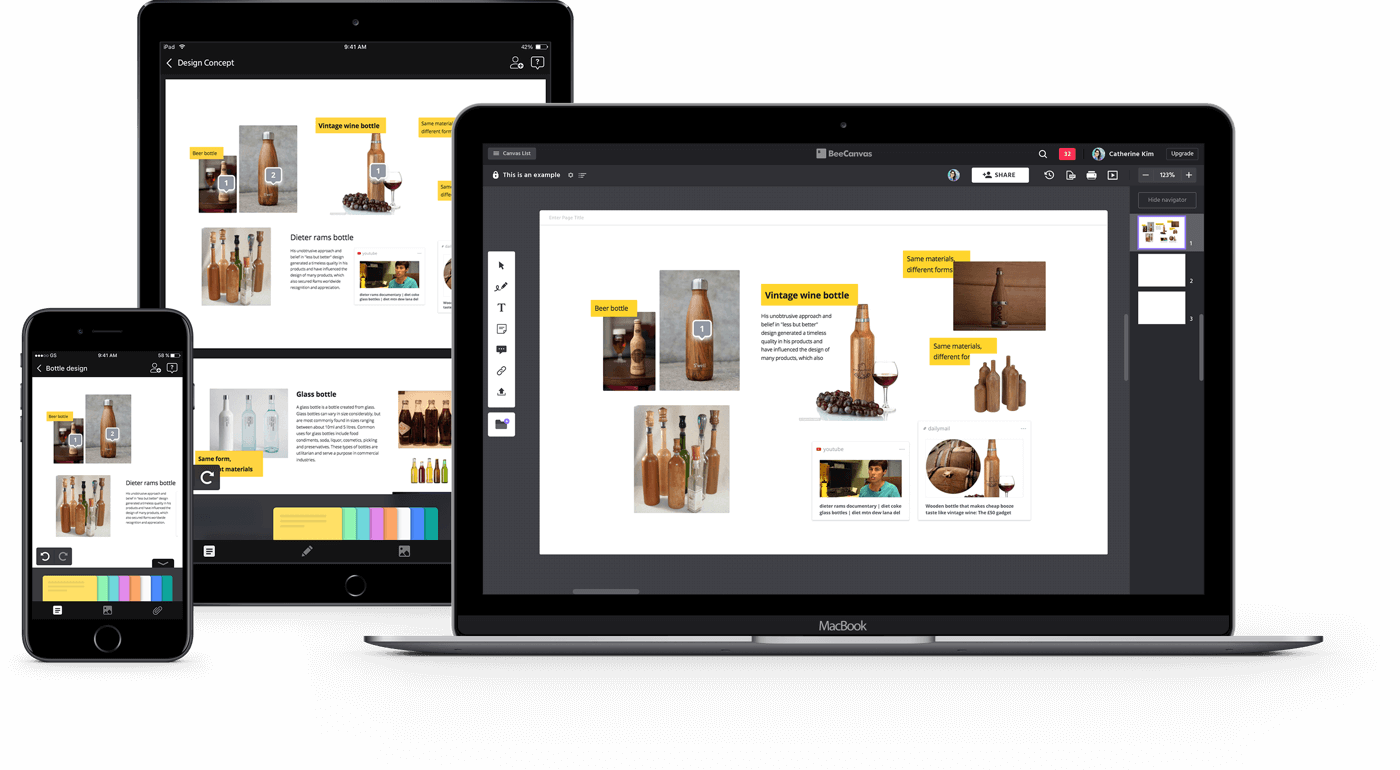
PLATFORM
iOS mobile, iPad, Web, Desktop
Canvas UI redesign
To start the project, it was important to understand the origins of my client's business. Space Oddity, a music entertainment company, found that musicians and their agents wanted to keep track of music consumption and musicians’ popularity. To solve this problem, Space Oddity gathers online data related to musicians and provides valuable consultation to their clients based on the analysis of massive amounts of music-related data. Peter provides real-time monitoring of six charts, social profiles, radio, TV, and several other websites in real-time.

"Our mission is to make the canvas itself explain its function through well-structured design using the renewal design."

The previous GNB (Global Navigation Bar) was not well structurally organized. It had two GNB's (A and B) but there was no clear distinction between them, which caused the GNB to take up too much space. They also needed to be divided by proper hierarchy.
It was not easy to identify the main features of BeeCanvas since in the first GNB, it included canvas list, canvas size, slide list, search, notifications and in the second GNB, online member, share link, template, backup, print, slideshow.
Each icon in the toolbar was designed differently, which breaks the continuity and design unity.
Goals
Intuitive GNB
Make sure the GNB clearly identifies the features and is well structured according to hierarchy
Toolbar Redesign
Toolbar icons need to with be consistent with the UI design concept
Coherent UI
Maintain consistency with BeeCanvas' mobile app's visual system
For those using BeeCanvas for the first time, how can we make the canvas UI more intuitive and easy to use? Would it be possible for users to make the most of the features and toolbars without watching tutorials?
The Frame of the Canvas User Interface
Before diving into designing each component, it was important to analyze the canvas UI structure. We all agreed on that the GNB had to be divided into 2 sections and each of them had to clearly have its own functions.
• Header 1 is about a user and a leading path to index or out of canvas.
• Header 2 is about a canvas and its features.

Test, test and test
With these basic instructions as my starting point, I then began designing many iterations using different visual styles and toolbar designs until I found what best displayed the structure and basic features.
Canvas UI Explorations
We tested several versions of UI color variations and finally agreed upon the dark theme which doesn’t look particularly different from the previous one but has a well organized GNB and tool bar.

Toolbar UI Explorations
Since the toolbar is one of the most important parts of the canvas UI, we needed to test many versions using different visual styles and icons. Our team all agreed that the toolbar had to be more distinctive in the dark theme but that each icon ought to be the same color.

The Final Design
Our biggest challenge in this project was designing the navigation of the data from various sources. The sources of our content were: SNS (Facebook, Instagram), music streaming services (Melon, Bugs, Mnet, Naver Music, Genie, Soribada), and search engines (Naver, Daum etc). To organize the content, we categorized the menu into two main sections. The first one was updated every time the user pushed the renew button, and the other one was crawling data within the range that users manually set.

• The title of the canvas, canvas list and canvas size setting was originally on the first GNB. However in the renewal design, all those buttons related to the canvas were moved to the second GNB.
• The icons (backup, PDF file, print, slideshow) that appeared on the second GNB as well as the toolbar icons have been redesigned as well.
• The overall tone and manner were designed to be in-keeping with BeeCanvas's brand guide.
Takeaway
Since the toolbar is one of the most important parts of the canvas UI, we needed to test many versions using different visual styles and icons. Our team all agreed that the toolbar had to be more distinctive in the dark theme but that each icon ought to be the same color.

Design with the common language
From mobile, tablet to desktop, BeeCanvas supports a wide range of devices. All these devices had to be designed in one common language to give a coherent experience. Under a consistent brand concept, I was able to produce style guides, mock-ups and visual images for marketing.